A More Intuitive iMessages: UX Proposal
The Fall of Google Search: Part 3 - Results Quality
Alexandra Lustig
Alexandra Lustig
Mar 28, 2024
Mar 28, 2024
A couple months ago I bought an iPhone 15. Before that, I was a die-hard Google Pixel user, from Pixel 2 XL to Pixel 7. I’m not gonna go into why I switched back to iPhone (that’s another, much longer post for another time), but there have been quite a few changes that I’ve had to learn or re-learn on iOS.
One feature I’ve tried to figure out is Pinned messages in iMessage. Pinned messages are not a new concept by any means; many other message platforms have this feature, but iMessage approaches it very differently in terms of design and UX. Typically, we see a list of messages upon opening our app of choice, with an established hierarchy of prioritization: Unread messages are understandably the highest priority for users, so they’re always showcased first in the list. I don’t think anyone really questions why Unread messages in a time-stamped list are at the top, so let’s move on. The next question is: how do we fit Pinned messages into this list?
The way we answer this question is to think about the user’s perspective on priority and ask ourselves a few more questions:
Are Pinned conversations more or less important to users than Unread messages? What about the most received messages, since users may purposefully leave an older message as Unread? What about Group chats? I would argue that because the entire purpose of the Pinned messages feature is to let the user specifically override any other (namely, more recent) message, they should be visually represented in the same way. I mean, it’s in the name, right? Users want to see those select conversations “pinned” to the top of their list. The idea of “pinning” something is showcased in many other UX and UI elements across the web, most readily seen on websites with what we call “pinned navigation,” but you may also see things like pinned pop ups, promos, cookie banners, etc. on websites. Now, what does that mean when we translate this priority into the UX and design for the app? We know users value those Pinned conversations above others, but does that mean they want to see them at the top of their screens, physically above the other messages? Most messaging platforms think “yes” and I’m pretty much inclined to agree with them. When introducing a Pinned messages feature, other apps usually just allow users to anchor those to the top of their existing list of messages. Apple, however, does it differently. In fact, the way Apple showcases Pinned conversations in iMessage is unlike anything I’ve seen on other apps or even in any other part of iOS.
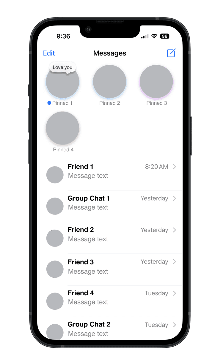
For example, when we look at the iMessage screen with an assortment of single-recipient conversations, Group chats, Unread messages, and Pinned messages, we see that Apple chose to showcase Pinned messages at the top of the screen, with large circular contact photos and lots of white space between each. The user can select a maximum of 9 conversations to pin (why 9? let’s come back to that…) and they’re shown in a grid of 3 across. These large contact photos are a fairly new design element, along with the use of colored drop shadows extended from each contact photo.
This is my quick de-personalized iMessages screen showcasing all of the above. You can see that the hierarchy works as follows:
Pinned messages
Unread messages
Everything else, sorted by recency
Don’t get me wrong, I don’t think Apple’s current Pinned iMessages are a terrible design, but I think they can definitely do better. I think with all of the different kinds of messages here, there should be more intuitive and robust navigation to find and sort all of them. Also, I just plain don’t like the way they show Pinned conversations. I think they’re too big, there’s too much whitespace, and if you have more than 3, they take up additional rows and space on your screen, effectively pushing down the 2nd highest priority item, Unread messages. The more Pinned conversations you have, the more space they take up on your screen, and the fewer “other” messages you can see when you open the app. I think it’s all just unnecessary and makes the iMessage app harder to use, not easier.
The idea of introducing navigation to iMessages is not a new one and I’m far from the first to suggest it. I’m merely throwing my hat into the conversation (hehe) and offering some mockups of what I think are an improved UX design.

Let’s begin with the Pinned conversations. Above is my mockup of what could be a new and improved Pinned conversations screen. I utilized the tabbed navigation design that iOS has on the Phone app for “All” and “Missed” calls and extended the idea to this screen. I added a total of 4 tabs and laid them out across the screen in the order of prioritization already mentioned, always starting from the left.
First, we have Pinned. Here we see all of the Pinned conversations exclusively, in a list sorted by recency. By having Pinned conversations accessible on their own tab, we allow the user to delineate the importance of those messages even more, and at the same time, open up more space for more than 9 to be added here. Quickly back to that maximum of 9 Pins currently available in iMessage- the only thing I can think of to explain this (and if you’re an engineer with info about the backend here, please raise your hand!) is that if you have 9 conversations pinned, their size and design will take up half of your screen (excluding Edit, Compose, and Search), and I’m guessing that the iMessage team thought that 50% was enough for the Pinned convos vs. other messages.
Anyway back to my mockup- the gold pins are a continuation of the current iconography that appear when the user is selecting conversations to Pin, but oddly they don’t appear anywhere else. I think the visual identification of these conversations, paired with the yellow/gold color, help them to stand out and carry greater importance for the visual hierarchy as well as the structural.
Next on the tabbed navigation is the Unread messages, which also has a nifty blue circle to demonstrate its state even in the tab, not just beside the conversations in the list. After that we have Group chat, which I believe would be a nice-to-have in terms of navigation for iMessage, and last is All messages.
The cool thing about the mobile device design is that even though All messages is technically “last” in this list, since we always move from left to right across the screen and since the user is typically holding their device in one hand, their thumb could ostensibly still reach the All messages tab quite easily. This makes the tabbed navigation actually give equal priority to the Pinned conversations as the All messages tab. I like that idea because whenever we re-design or add something to a screen that users are already very comfortable with and used to, we’re adding a barrier to entry. The barrier could be education (we have to educate the user about the new thing), usability (they might have to change the way they’ve used the app historically), or even something else. We always want to minimize the number of barriers we have and hopefully have a friction-less continuation of usage. I think that by having the All messages tab equally accessible to the Pinned tab, we’re allowing users to effectively continue to use the current default screen for iMessage in this (proposed) update.
Let’s take a look at what that screen could look like.
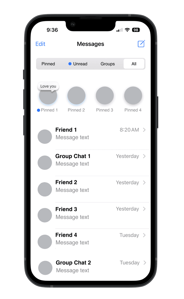
Here we see the new All messages tab, which is the current opening (and only) screen for iMessages. The tabbed navigation is at the top, of course. The Pinned conversations still appear at the top of screen as they do currently, but they’re much smaller, have less space around them, and I would propose a maximum of 4 conversations be shown at one time to keep them to one row. We can do that now, since Pinned conversations have their own tab and users can see all of them there. Lastly, we have the rest of our messages, as always, sorted by most recent.
And there you have it, folks! A first stab at a new iMessages with intuitive and continuous iOS UX incorporated.
Thanks for reading and I’d love to hear your thoughts on what you think iMessage should add in their next update!
This article was originally published on a Squarespace domain. Comments from that domain have been lost.
A couple months ago I bought an iPhone 15. Before that, I was a die-hard Google Pixel user, from Pixel 2 XL to Pixel 7. I’m not gonna go into why I switched back to iPhone (that’s another, much longer post for another time), but there have been quite a few changes that I’ve had to learn or re-learn on iOS.
One feature I’ve tried to figure out is Pinned messages in iMessage. Pinned messages are not a new concept by any means; many other message platforms have this feature, but iMessage approaches it very differently in terms of design and UX. Typically, we see a list of messages upon opening our app of choice, with an established hierarchy of prioritization: Unread messages are understandably the highest priority for users, so they’re always showcased first in the list. I don’t think anyone really questions why Unread messages in a time-stamped list are at the top, so let’s move on. The next question is: how do we fit Pinned messages into this list?
The way we answer this question is to think about the user’s perspective on priority and ask ourselves a few more questions:
Are Pinned conversations more or less important to users than Unread messages? What about the most received messages, since users may purposefully leave an older message as Unread? What about Group chats? I would argue that because the entire purpose of the Pinned messages feature is to let the user specifically override any other (namely, more recent) message, they should be visually represented in the same way. I mean, it’s in the name, right? Users want to see those select conversations “pinned” to the top of their list. The idea of “pinning” something is showcased in many other UX and UI elements across the web, most readily seen on websites with what we call “pinned navigation,” but you may also see things like pinned pop ups, promos, cookie banners, etc. on websites. Now, what does that mean when we translate this priority into the UX and design for the app? We know users value those Pinned conversations above others, but does that mean they want to see them at the top of their screens, physically above the other messages? Most messaging platforms think “yes” and I’m pretty much inclined to agree with them. When introducing a Pinned messages feature, other apps usually just allow users to anchor those to the top of their existing list of messages. Apple, however, does it differently. In fact, the way Apple showcases Pinned conversations in iMessage is unlike anything I’ve seen on other apps or even in any other part of iOS.
For example, when we look at the iMessage screen with an assortment of single-recipient conversations, Group chats, Unread messages, and Pinned messages, we see that Apple chose to showcase Pinned messages at the top of the screen, with large circular contact photos and lots of white space between each. The user can select a maximum of 9 conversations to pin (why 9? let’s come back to that…) and they’re shown in a grid of 3 across. These large contact photos are a fairly new design element, along with the use of colored drop shadows extended from each contact photo.
This is my quick de-personalized iMessages screen showcasing all of the above. You can see that the hierarchy works as follows:
Pinned messages
Unread messages
Everything else, sorted by recency
Don’t get me wrong, I don’t think Apple’s current Pinned iMessages are a terrible design, but I think they can definitely do better. I think with all of the different kinds of messages here, there should be more intuitive and robust navigation to find and sort all of them. Also, I just plain don’t like the way they show Pinned conversations. I think they’re too big, there’s too much whitespace, and if you have more than 3, they take up additional rows and space on your screen, effectively pushing down the 2nd highest priority item, Unread messages. The more Pinned conversations you have, the more space they take up on your screen, and the fewer “other” messages you can see when you open the app. I think it’s all just unnecessary and makes the iMessage app harder to use, not easier.
The idea of introducing navigation to iMessages is not a new one and I’m far from the first to suggest it. I’m merely throwing my hat into the conversation (hehe) and offering some mockups of what I think are an improved UX design.
Let’s begin with the Pinned conversations. Above is my mockup of what could be a new and improved Pinned conversations screen. I utilized the tabbed navigation design that iOS has on the Phone app for “All” and “Missed” calls and extended the idea to this screen. I added a total of 4 tabs and laid them out across the screen in the order of prioritization already mentioned, always starting from the left.
First, we have Pinned. Here we see all of the Pinned conversations exclusively, in a list sorted by recency. By having Pinned conversations accessible on their own tab, we allow the user to delineate the importance of those messages even more, and at the same time, open up more space for more than 9 to be added here. Quickly back to that maximum of 9 Pins currently available in iMessage- the only thing I can think of to explain this (and if you’re an engineer with info about the backend here, please raise your hand!) is that if you have 9 conversations pinned, their size and design will take up half of your screen (excluding Edit, Compose, and Search), and I’m guessing that the iMessage team thought that 50% was enough for the Pinned convos vs. other messages.
Anyway back to my mockup- the gold pins are a continuation of the current iconography that appear when the user is selecting conversations to Pin, but oddly they don’t appear anywhere else. I think the visual identification of these conversations, paired with the yellow/gold color, help them to stand out and carry greater importance for the visual hierarchy as well as the structural.
Next on the tabbed navigation is the Unread messages, which also has a nifty blue circle to demonstrate its state even in the tab, not just beside the conversations in the list. After that we have Group chat, which I believe would be a nice-to-have in terms of navigation for iMessage, and last is All messages.
The cool thing about the mobile device design is that even though All messages is technically “last” in this list, since we always move from left to right across the screen and since the user is typically holding their device in one hand, their thumb could ostensibly still reach the All messages tab quite easily. This makes the tabbed navigation actually give equal priority to the Pinned conversations as the All messages tab. I like that idea because whenever we re-design or add something to a screen that users are already very comfortable with and used to, we’re adding a barrier to entry. The barrier could be education (we have to educate the user about the new thing), usability (they might have to change the way they’ve used the app historically), or even something else. We always want to minimize the number of barriers we have and hopefully have a friction-less continuation of usage. I think that by having the All messages tab equally accessible to the Pinned tab, we’re allowing users to effectively continue to use the current default screen for iMessage in this (proposed) update.
Let’s take a look at what that screen could look like.
Here we see the new All messages tab, which is the current opening (and only) screen for iMessages. The tabbed navigation is at the top, of course. The Pinned conversations still appear at the top of screen as they do currently, but they’re much smaller, have less space around them, and I would propose a maximum of 4 conversations be shown at one time to keep them to one row. We can do that now, since Pinned conversations have their own tab and users can see all of them there. Lastly, we have the rest of our messages, as always, sorted by most recent.
And there you have it, folks! A first stab at a new iMessages with intuitive and continuous iOS UX incorporated.
Thanks for reading and I’d love to hear your thoughts on what you think iMessage should add in their next update!
This article was originally published on a Squarespace domain. Comments from that domain have been lost.