How did they choose that new Disney Plus icon?
The Fall of Google Search: Part 3 - Results Quality
Alexandra Lustig
Alexandra Lustig
Mar 26, 2024
Mar 26, 2024
Lots of people on the internet have opinions on the new Disney+ app icon that debuted this week with a new color palette and gradient shape.
I’ll admit I’m not a big fan of the color changes they used for the new streaming app icon either. The iconic navy and royal blues of Disney’s brand feel muddied by the addition of what feels like a dull green color overlay. Disney Plus has been using this logo for the past five years since it was released in 2019, so of course any change now is going to be met with some criticism. Let’s face it: people just don’t like change.
But I feel like the deeper meaning behind this change really underscores the evolution of the Disney Plus service. What used to be exclusively Disney-produced content will now be (probably) showcasing more of their purchased and co-owned content due to their unification with streaming service, Hulu. The original Disney Plus colors of royal and navy blues were reminiscent of older Disney classics like Cinderella, The Lion King, and 101 Dalmatians. The new Disney Plus colors show a merging of Hulu’s famous green color.
This got me thinking. Is the new app icon really just the Disney colors plus the Hulu green, or is it something more? I decided to play around with their palettes to find out.
Reddit user Lanceoz did a comparison of the gradients to see how the colors morph into one another, declaring that “the new color was a combination of Disney+ blue and Hulu green [is] pretty spot on.”
Now, it definitely looks like a combination of some sort, but which sort, exactly?
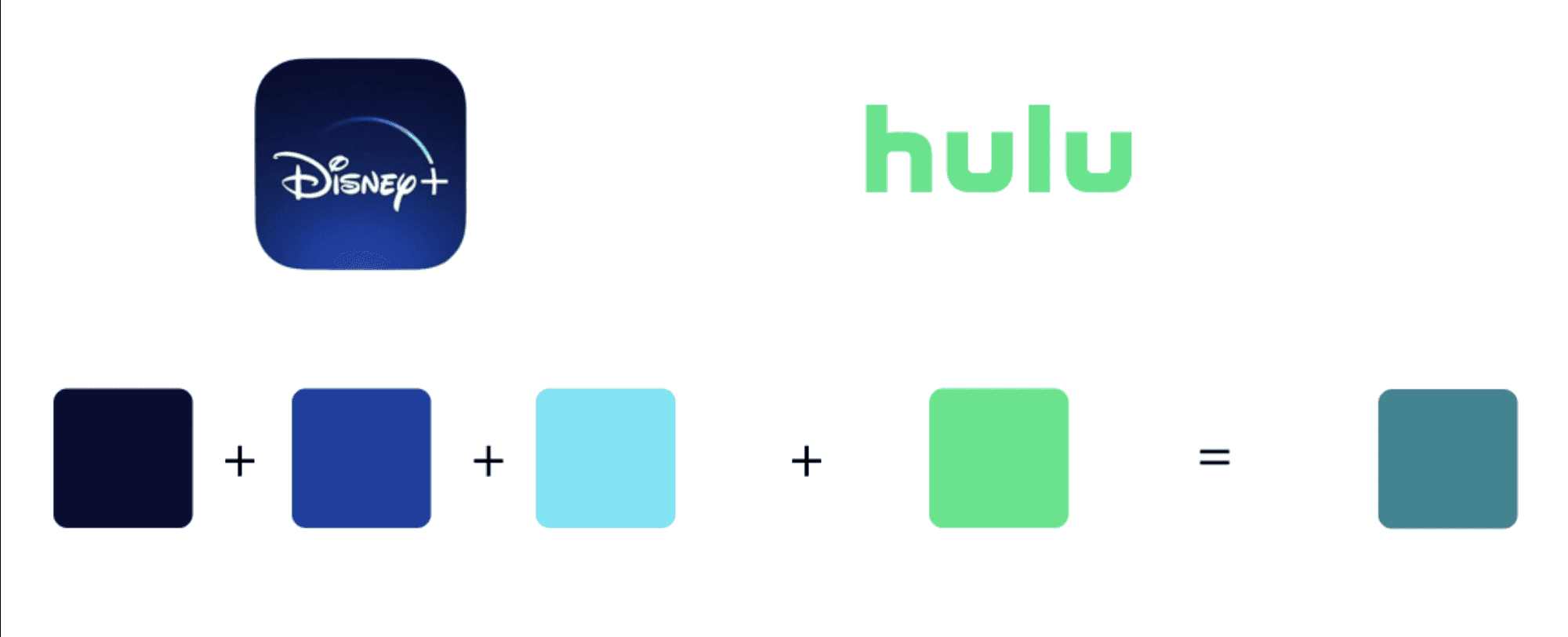
I decided to break out the colors most prominent in each streaming service’s icon and combine them individually to see if that translated into the new Disney Plus icon. As you can see in the above, if we took each of the 3 blues in the Disney Plus icon and combined 50% of each one with 50% of the Hulu green, we get a variation of what we would expect to see in the new icon. The top combination is definitely more of a green, while the other two are teal and what I’d call an aquamarine color. Not one of these three colors looks exactly like the teal we’re seeing in the new icon, however.
So then I really started to get nerdy. I thought about how I was approaching the above combination. Since Disney’s icon has 3 colors (that I’m using) and Hulu’s icon only has one color, I’m effectively splitting Disney’s weight into 3: i.e. 50% of 1/3 of Disney + 50% of Hulu, for each line, if the final variable for each line equals 100%.
So to calculate each of the 3 final variables (v1, v2, v3), I’m doing this equation:
(1/3D)/2 + H/2 = v1
(1/3D)/2 + H/2 = v2
(1/3D)/2 + H/2 = v3
You can also think about it like this:
#080E32 at 50% + #1CE783 at 50% = #127B5A
#1440A1 at 50% + #1CE783 at 50% = #189491
#5EE6F5 at 50% + #1CE783 at 50% = #3CE6BC
But again, you’ll notice that since Disney’s 3 elements are each combined with Hulu’s one color, we’re giving Hulu 3x the color weight in this equation.
That means we’re effectively giving Hulu 3x the importance in this merger than Disney.
Still with me?
Ok, so what if we actually give Disney’s 3 and Hulu’s 1 equal weight? What would that look like?
As you can see, our result is now only one color, not three, but it’s almost exactly the same color as the mid-tone in the new Disney Plus icon.
This combination of variables also makes a bit more sense if we think about the size of each platform.
Hulu has about 49 million paying subscribers as of March 2024, whereas Disney Plus has about 150 million. That very neatly lines up with my theory just from the app icons that Hulu is 1/3 of Disney, not the other way around.
So where does that leave us math nerds?
Instead of splitting up Disney into 3 parts, let’s give each of Disney’s 3 colors equal weight, then add in one of Hulu’s green.
Now we’re doing #080E32 + #1440A1 + #5EE6F5 + #1CE783 = #258792
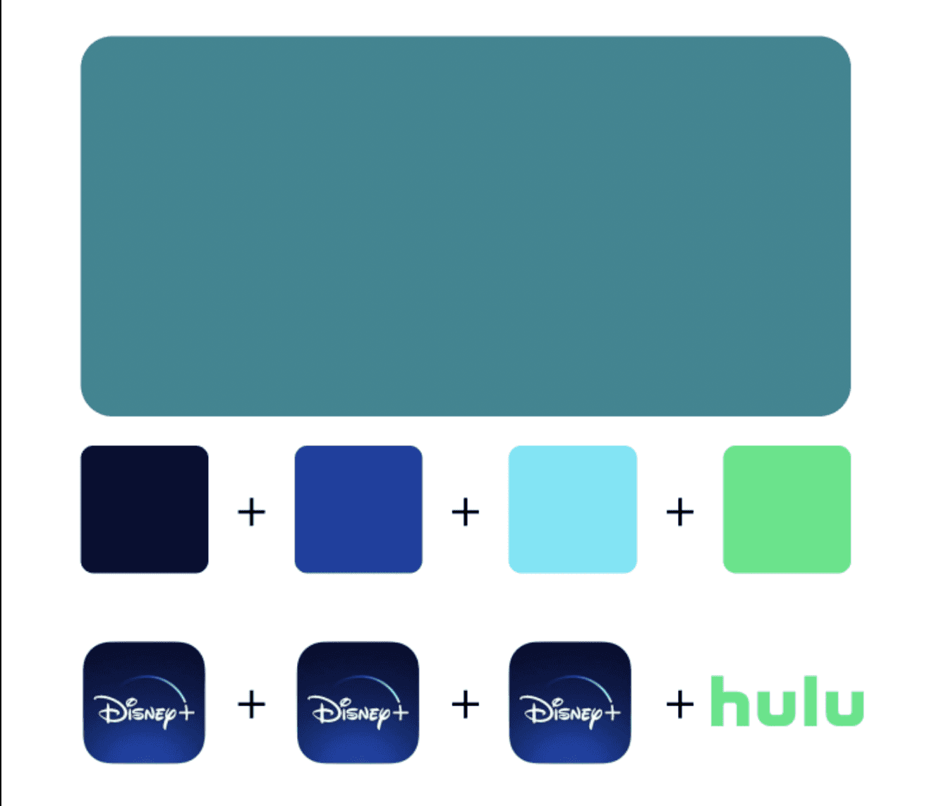
Now we can just take that teal result and extrapolate the other two high and low points for the gradient.
And voilà. The new Disney Plus icon.
Thank you for your time, fellow nerds. I hope this was kind of interesting for you, it was super fun for me!
This article was originally published on a Squarespace domain on 3/26/24. Comments from that domain have been lost.
Lots of people on the internet have opinions on the new Disney+ app icon that debuted this week with a new color palette and gradient shape.
I’ll admit I’m not a big fan of the color changes they used for the new streaming app icon either. The iconic navy and royal blues of Disney’s brand feel muddied by the addition of what feels like a dull green color overlay. Disney Plus has been using this logo for the past five years since it was released in 2019, so of course any change now is going to be met with some criticism. Let’s face it: people just don’t like change.
But I feel like the deeper meaning behind this change really underscores the evolution of the Disney Plus service. What used to be exclusively Disney-produced content will now be (probably) showcasing more of their purchased and co-owned content due to their unification with streaming service, Hulu. The original Disney Plus colors of royal and navy blues were reminiscent of older Disney classics like Cinderella, The Lion King, and 101 Dalmatians. The new Disney Plus colors show a merging of Hulu’s famous green color.
This got me thinking. Is the new app icon really just the Disney colors plus the Hulu green, or is it something more? I decided to play around with their palettes to find out.
Reddit user Lanceoz did a comparison of the gradients to see how the colors morph into one another, declaring that “the new color was a combination of Disney+ blue and Hulu green [is] pretty spot on.”
Now, it definitely looks like a combination of some sort, but which sort, exactly?
I decided to break out the colors most prominent in each streaming service’s icon and combine them individually to see if that translated into the new Disney Plus icon. As you can see in the above, if we took each of the 3 blues in the Disney Plus icon and combined 50% of each one with 50% of the Hulu green, we get a variation of what we would expect to see in the new icon. The top combination is definitely more of a green, while the other two are teal and what I’d call an aquamarine color. Not one of these three colors looks exactly like the teal we’re seeing in the new icon, however.
So then I really started to get nerdy. I thought about how I was approaching the above combination. Since Disney’s icon has 3 colors (that I’m using) and Hulu’s icon only has one color, I’m effectively splitting Disney’s weight into 3: i.e. 50% of 1/3 of Disney + 50% of Hulu, for each line, if the final variable for each line equals 100%.
So to calculate each of the 3 final variables (v1, v2, v3), I’m doing this equation:
(1/3D)/2 + H/2 = v1
(1/3D)/2 + H/2 = v2
(1/3D)/2 + H/2 = v3
You can also think about it like this:
#080E32 at 50% + #1CE783 at 50% = #127B5A
#1440A1 at 50% + #1CE783 at 50% = #189491
#5EE6F5 at 50% + #1CE783 at 50% = #3CE6BC
But again, you’ll notice that since Disney’s 3 elements are each combined with Hulu’s one color, we’re giving Hulu 3x the color weight in this equation.
That means we’re effectively giving Hulu 3x the importance in this merger than Disney.
Still with me?
Ok, so what if we actually give Disney’s 3 and Hulu’s 1 equal weight? What would that look like?
As you can see, our result is now only one color, not three, but it’s almost exactly the same color as the mid-tone in the new Disney Plus icon.
This combination of variables also makes a bit more sense if we think about the size of each platform.
Hulu has about 49 million paying subscribers as of March 2024, whereas Disney Plus has about 150 million. That very neatly lines up with my theory just from the app icons that Hulu is 1/3 of Disney, not the other way around.
So where does that leave us math nerds?
Instead of splitting up Disney into 3 parts, let’s give each of Disney’s 3 colors equal weight, then add in one of Hulu’s green.
Now we’re doing #080E32 + #1440A1 + #5EE6F5 + #1CE783 = #258792
Now we can just take that teal result and extrapolate the other two high and low points for the gradient.
And voilà. The new Disney Plus icon.
Thank you for your time, fellow nerds. I hope this was kind of interesting for you, it was super fun for me!
This article was originally published on a Squarespace domain on 3/26/24. Comments from that domain have been lost.